Posted on Leave a comment

A berry merry Christmas

misteltoe and holly

Dare I say it? The C-word? No not C*v*D… It seems Christmas is only a few short weeks away even though it only seems like five minutes since I was wrapping presents into the wee small hours last time.

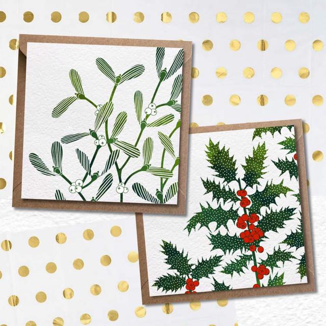
Since last year’s Christmas cards flew out the door I decided to illustrate a couple of new designs for 2021. This year’s designs are traditional with a modern twist and they incorporate the mark-making techniques that everyone enjoys so much. So, without further ado – I bring you – Holly and Mistletoe.

Christmas in Scotland just wouldn’t be complete without these two. Perhaps the Mistletoe brings back some innocent memories of a first kiss or childhood memories of receiving a prickly jag from the leaves of the Holly. Against the backdrop of snow, the Holly’s blood-red berries create a dramatic splash of colour. Both of these berries provide food for birds throughout the winter – particularly for our feathery friend the Robin who featured in last year’s cards along with his festive friend the Pheasant.

As you know, I take pride in creating original artwork. OK – I admit it – I am a perfectionist and strive for quality across everything I do – from the illustration and artwork to the packaging. I treat each piece as a work of art – to the point that even our greeting cards can be framed as a small print in their own right (well that’s what I used to do when I was a poor student – and still enjoy doing now if I’m honest).  This year’s cards are no different. The Holly and Mistletoe designs are printed on heavy-weight textured cardstock, from fully sustainable forests. Card is 150x150mm, with a brown Kraft envelope and compostable sleeve and they are available in packs of four – two in each design.

I hope you’ll enjoy sending these new designs to your friends or perhaps you’ll decide to keep them for yourself – I won’t tell.  

Send me a quick message if you’d like to get your order in now. After all, Christmas is coming whether we like it or not – at least we can make a start with some Holly, Mistletoe – and maybe some wine.

Posted on Leave a comment

Looks like rain …

My latest illustration was inspired by a conversation with my sister. She lives in Australia and though we manage to stay connected through technology, she still feels homesick for all the people and places she loves in Scotland. It’s been three years since she’s been home, so I thought I’d get creative and remind her what she’s missing. What could be more reminiscent of Scotland than rain – especially when Scotland has so many different types to choose from.

As it turns out, we Scots have over 100 words for the myriad of forms rain takes – each more descriptive than the last. I then had the idea to combine these words with a mark-making exercise to replicate the look and feel of said rain being described. My sister loved it so much I thought I’d share it with you.

If you are unfamiliar with Scottish rain, it may surprise you to know rain doesn’t always fall in a uniform manner – (i.e., straight down from the sky to the ground). It often bounces off the ground (stoatin) in a persistent, deafening cacophony or it’s blown sideways in your face by a strong wind (yillen). This type of rain can feel like needles to the face and eyes – while the dreich type of rain just hangs, limp in the air. It’s a ‘feeling’ that permeates everything in a slow, somewhat dreary manner. Dreich is the more depressed cousin of  Smirr (lazy rain) in that you don’t see physically formed raindrops, but everything is just a hazy, frizzy dampness. In fact, the word smirr sounds very much like the Danish word for mist which is smoor – so you can really get a sense of what this rain feels like.

Scotland is without doubt one of the most stunning and lush in the world. It is one of the things my sister comments on when she does make it home – how green and lush everything is compared to some of the dried, sunburnt vistas of Australia. So, while we may bitterly complain about the rain in all its forms, it is part of our identity and is the source of much of the natural beauty that surrounds us here – the mountains, the lochs, the heather, the grain for the whisky … oh I better stop there. I don’t want to make my sister homesick all over again.

If you love the rain or perhaps you are someone living away from Scotland and you’re feeling just a touch homesick, then this could be just the print for you. The print will soon be available to buy in the online store – once I replenish my stock levels – in the meantime, you can order from me by sending a messages on Facebook on Instagram.

I thought I’d let my sister have the last word on this one since it was created with her in mind after all.

“I love this – it’s a perfect combination of the Scots language, Scottish weather and creativity. It really does connect me instantly with home and memories of dreich days and getting drookit. I never thought I’d miss the different types of rain, but your clever work even conjures up the smell for me. Love. Love. Love.”

Posted on Leave a comment

Howe Collective Market Weekend

HoweCollective

10% off all items in store for this weekend only

Bumbumbee Creative is delighted to be joining the Howe Collective for Market Weekend this weekend!

You will receive 10% off any item in our online store when you apply the
HOWE10 discount code before checkout. Discount Code will be valid on 14th & 15th November until midnight GMT so get in quick.

To make it even easier to order you can also email emma@bbbeecreative.com or message BumBumbee Creative on Facebook (but remember to quote the HOWE10 code to receive your discount). 

This is a  #shoplocal event so do please support us and your local artists, designers and talented makers of gorgeous things.

Enjoy these special offers and new products all made with love 

You can get involved in all the action when you FOLLOW @howecollective on Facebook and Instagram or if you search online for #hconlinemarket for a list of stalls.

Like, share, comment and help us spread the word! 
HoweCollective

Posted on Leave a comment

The importance of making our mark

Fiver Fest New Product

If you are familiar with my artwork, you will know, like many artists, I am inspired by the landscape, nature, wildlife and the environment in general. However, if you take a closer look at ‘Burntisland Map’, one of my coastal creations inspired by my life in this historic sea-port town, you will see something unique, almost hidden, amongst the brushstrokes.

To the north of this historic Burgh, looms The Binn, a volcanic plug, which rises 193 metres (632 ft) above sea level, and a well-loved Landmark on the Fife coastline. As if boasting our very own extinct volcano was not unique enough, a discovery of its ancient carvings is certainly something to capture the imagination.

The carvings are known as ‘Cup and Ring’ – and consist of a wide cup-mark with three very well-defined concentric rings around it. Archaeologists estimate the markings are around 4000 years old – which means they were already pretty old when the carvings were made in the Wemyss Caves 3000 years ago.

It’s unlikely that you will discover these carvings unless you have been shown where they are. After all, they have managed to remain hidden and protected for 4000 years. It’s one of the reasons I decided their appearance should be subtle, and slightly hidden from view in my artwork too.

We can but imagine who took hundreds of hours to carve these, or perhaps even more intriguingly, why they were created in the first place? What do they mean? From the earliest times, we as humans have always desired to make our mark. We wish to let the world know we lived a life and we have a need to ‘express’ the nature of that life whether that’s through words, books, music, paintings or … rock carvings.

With that said, there is something modern about these marks, as though they are radio or transmission waves, rippling out under a starlit sky across the Firth of Forth. Whatever their purpose or significance, these carvings are a communication – a bridge, a tangible connection, between the ancient world and now.

These Cup and Ring marks provide a much-needed reminder that, long before the threat of COVID, and long before our current homes and schools and businesses were built, there have always been artisans, creatives, farmers, fishermen, traders and families each sharing a desire to make their mark – to connect and contribute to the thriving community of Burntisland.

Regardless of their actual meaning, to me personally, the Cup and Ring carvings symbolise hope. As we face these times of uncertainty, our distant ancestors sent us a message of endurance and resilience – much like the rocks on which these carvings were. It’s a message that our community has weathered many storms, from shipwrecks, to witchcraft trials, to rebellions to recessions – but we are all still here.

It is my wish that when you give a home to this special piece, you will be reminded just how resilient we all are – and no matter how challenging life may seem, it’s never too late to make your mark. Where there is community, you will always find hope.

If you would like to buy ‘Burntisland Map’ it is a brand new design created to especially to celebrate our local town and the amazing community that live and work here. Don’t forget to enter the promotional code – valid until 24th October, 2020.

Alternatively, why not make a bee line for our original ‘Bee Happy‘ series of greeting cards – original artwork and yours for a Fiver – but get in quick. These beauties are flying out the door fast.

Posted on 1 Comment

Let Illuminated lettering light up your world

ABC Lettering

Bumbumbee is always busy with new creations, but it’s been busier than usual recently.  You see it’s a certain little lady’s first birthday very soon and I have been pulling out the creative stops to conjure up something special to mark the occasion. While I was in the ‘zone’ thinking through numerous ideas, I began exploring concepts around personalised decoration.

Creating in the ‘wee small hours’ as is often the case around here, I worked through a few mock-ups, designs and themes until I settled upon ‘Illuminated Lettering’.

Contrary to what it may sound like, ‘Illuminated Lettering’ does not light up – well not in the way Blackpool does. That said, ‘Illuminated’ comes from the Latin ‘illuminare’ which does actually mean ‘to light up’ – so traditionally there is a ‘glow’ created by radiant colours used for the lettering or illustrations.

Many of you would know of ‘Illuminated lettering’ if you have been to church or are familiar with the artwork in Bibles. In the Christian Scripture Manuscripts, that lettering would often be decorated by real gold and silver. These hand-made illuminated manuscripts were initially created by monks in abbeys.  Just imagine what a painstaking process that must have been.

As you can see, I have taken this concept and given it a modern twist using gorgeous, Scottish wildflowers for inspiration, though the range of potential customisations is limitless.

Here at Bumbumbee, we think you’ll agree these decorated alphabet letters would brighten up any room or birthday party celebration. They work equally well on their own if you want to use them as artwork to represent your family members in your household. After all, they are pieces of art in their own right.

So without further ado, I’m pleased to announce our latest Bumbumbee creation is now up on our online store. Well, I couldn’t keep these letters to ourselves could I?

To order, just message me to let me know which letters you would like and I’d love to know how you will use your ‘Illuminated Letters’ too. I have also included a link to our online store so you can go ahead and order there too.

As with all our Artwork, a file can be emailed to you once I’ve completed your letter(s) – so you have the flexibility to print out at home yourself. Alternatively, I can organise delivery with a quality window mount so it’s ready to hang on the wall.