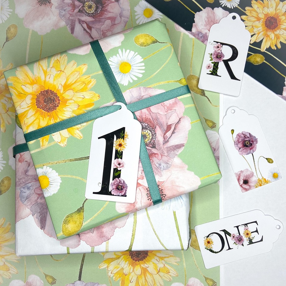
For those of you who follow us on Instagram, you may have seen the range of wrapping papers and gift tags being created for a certain little ‘wild one’. It’s Rosie’s First Birthday coming up very soon and I wanted to create a very colourful – not forgetting stylish – event to mark the occasion. As I played with the various colours (OK, obsessed about various colours – it really is a rabbit hole once you go down there), I thought about the role colour plays in our lives– not just from a creative perspective.
Colour influences us in so many ways – some of which we are not even aware of. Take branding for example. Our own, Bumbumbee core palette is centred around the beautiful, vibrant yellow of the bumblebee. This colour represents ‘joy’ and ‘happiness’ which is certainly what we would like people to feel when they connect with us in the community or through our artwork.
Interestingly, given I am also a teacher, the colour ‘yellow’ has been shown to stimulate our intellect – so if you are studying it’s a good idea to surround yourself with yellow.
Nature is full of colour; our world is full of colour and it communicates with us in ways that support our health and wellbeing. We know when we see a ‘Red’ light we should stop (or risk being hit by a car). We have expressions that communicate emotions and feelings around colour – ‘green with envy’, ‘feeling blue’ or ‘in the pink’. Even the medical profession and complementary therapists harness the power of colour and the wavelengths at which they vibrate. You may even have experienced infrared or ultraviolet light in the medical environment. Red stimulates blood flow, oranges and yellows stimulate our nerves and blues and violet are ‘cooling’ and can be utilised for anti-inflammatory properties.
One of the most obvious ways we can ‘experience’ the effect of colour is in our own homes. How we use colour will either create a calming and relaxed vibe or perhaps a warm, inviting atmosphere.
If you are really hoping your child sleeps through the night and wakes up refreshed, then it’s probably best to ensure muted tones. It seems to be universally accepted that blue is the best colour to promote sleep. Blue is said to contribute to longer rest and is calm and soothing. The reason for this has a lot to do with your eyes. There are special receptors in your eyes called “ganglion cells” and these are sensitive to the colour blue. These cells communicate with the part of your brain that controls your circadian rhythm – so worth keeping in mind if you have a restless child at night.
When you think about the many ways in which we use colour, you realise just how important it is for our children’s development – which in turn shows you how important visual arts and crafts are. Here are just a few examples to think about.
We use colour to:
- speed up a visual search
- improve object recognition
- enhance meaning
- convey structure
- establish identity
- symbolism
- improve usability
- communicate mood
So, you can see why I spend a ‘seemingly’ inordinate amount of time ‘playing’ with background colours and shades, tones and hues. It’s about creating a memorable and happy experience – setting the right tone and enhancing meaning. It’s also a creative and fun way to engage with a one year old and introduce her to a world beyond the traditional ‘pinks’.
Well, as I mentioned earlier, I also teach, so I am heading back into the classroom after a long break. I have to say I am feeling a little blue myself – simply because it means leaving behind my special little ‘wild one’ and her brother. They add their own splash of colour to our lives and lockdown has certainly been an ‘experience’. That said, I am lucky I get to share my passion for colour with a new generation of Scottish school children.
In the meantime, I will look forward to my little ‘wild ones’ colourful birthday celebration and who knows I may have a few more colour variations of wrapping paper in me yet so watch this space.
