Every year since 2000, the Pantone Colour Institute has proclaimed a particular colour “Colour of the Year”. Last year Pantone chose two colours probably sensing we all needed a double boost of colour in our lives. We had Ultimate Grey (17-5104) and the Illuminating 13-0647 (a brilliant yellow similar to our logo). I must have been on to something last year at this time when I wrote ‘putting the brilliance in resilience.’ Pantone noted the symbolism of the choice. “A marriage of colour conveying a message of strength and hopefulness that is both enduring and uplifting.”
So what’s colour of the Year all about? Twice a year representatives from various nations’ colour standards groups gets together in a secret meeting. After two days of presentations and debate, they choose a colour for the following year that connects with the mood of the moment; for example, the press release declaring Honeysuckle the colour of 2011 said, “In times of stress, we need something to lift our spirits. Honeysuckle is a captivating, stimulating colour that gets the adrenaline going – perfect to ward off the blues.”
The results of the meeting are published in Pantone View, which consumer-led businesses such as interior designers, fashion designers, florists and creatives buy to help guide their designs and planning for future products. In a nutshell, Colour of the Year provides strategic direction for the world of trend and design and the colour palettes you see in stores.
What’s in store for 2022 you wonder? Drumroll…
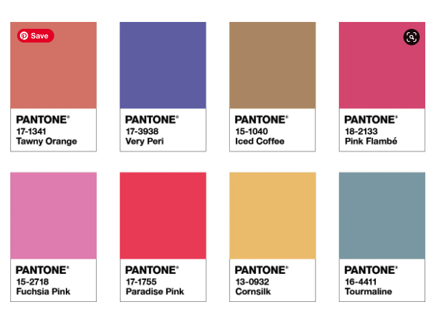
PANTONE 17-3938 Very Peri
Here’s what the Pantone website has to say on this year’s colour choice…
“Displaying a carefree confidence and a daring curiosity that animates our creative spirit, inquisitive and intriguing PANTONE 17-3938 Very Peri helps us to embrace this altered landscape of possibilities, opening us up to a new vision as we rewrite our lives. Rekindling gratitude for some of the qualities that blue represents complemented by a new perspective that resonates today, PANTONE 17-3938 Very Peri places the future ahead in a new light.
“We are living in transformative times. PANTONE 17-3938 Very Peri is a symbol of the global zeitgeist of the moment and the transition we are going through. As we emerge from an intense period of isolation, our notions and standards are changing, and our physical and digital lives have merged in new ways. Digital design helps us to stretch the limits of reality, opening the door to a dynamic virtual world where we can explore and create new colour possibilities. With trends in gaming, the expanding popularity of the metaverse and rising artistic community in the digital space PANTONE 17-3938 Very Peri illustrates the fusion of modern life and how colour trends in the digital world are being manifested in the physical world and vice versa.
“Encompassing the qualities of the blues, yet at the same time possessing a violet-red undertone, PANTONE 17-3938 Very Peri displays a spritely, joyous attitude and dynamic presence that encourages courageous creativity and imaginative expression.”
Here at Bumbumbee Creative we celebrate courageous creativity and our littlest Bumbumbee’s certainly have imaginative expression covered that’s for sure. I sense this will be a year where we all roll with whatever changes are presented to us until we each decide which new direction we wish to take. We may need to be courageous, not just in our creativity but in life itself, perhaps making decisions about things we hadn’t planned to make, perhaps having to adapt to new circumstances in the blink of an eye. Change can be scary, but it also offers us something new which may not otherwise have been an option. As long as we keep coming back to what’s important and focus on gratitude for the simple joys in life, we will have firm foundations from which to explore exciting possibilities for the future.
Bumbumbee’s motto is, “Be creative. Be inspired. Be an individual… but most of all Be kind.” Perhaps we should add Be Courageous in there too.
I’m off to bring a splash of Very Peri to proceedings in the studio. I hope you all have a joy-filled, creative year.